Ophelia Spa & Wellness, where beauty, health, and inclusivity come together to make wellness simple. Their commitment to holistic wellness is evident in every aspect, and they’ve enlisted my help to ensure a seamless experience. More than a traditional spa, Ophelia offers an experience where everyone is embraced. With a range of beauty and wellness services complemented by a carefully curated food and beverage menu, Ophelia enhances every treatment. Their diverse clientele, primarily women aged 22-75, reflects a shared dedication to self-care across various backgrounds, journeys, and abilities.
Ophelia needed everything to launch the brand from scratch. Drawing inspiration from Shakespeare’s “Hamlet” and the iconic painting inspired by the character, Ophelia embodies the character’s innate desire to heal and help—a goal that drove Grace and Charlotte Locklear. Their journey began when a close friend couldn’t enjoy a standard spa treatment due to health issues, highlighting a gap they were eager to fill.
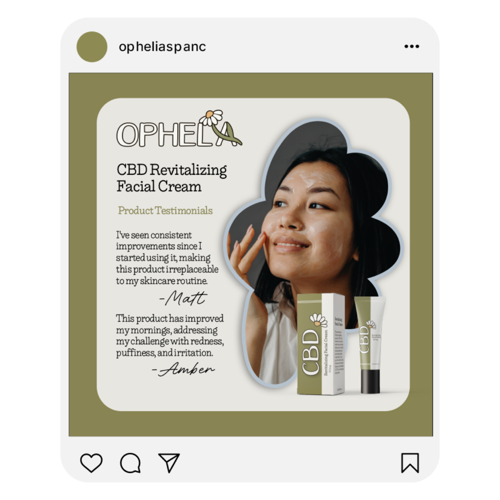
As the designer, I crafted the brand identity for Ophelia, encompassing various brand marks, carefully chosen colors, and distinct fonts and pairings. I opted for earthy tones, floral elements, and organic typography to evoke the healing and natural ambiance they desired for their brand. Additionally, I created essential materials to launch Ophelia, including an intake form for new clients, a comprehensive service menu, their healing and pain management CBD product line, and commerce items like shopping bags and gift cards, along with advertising materials.


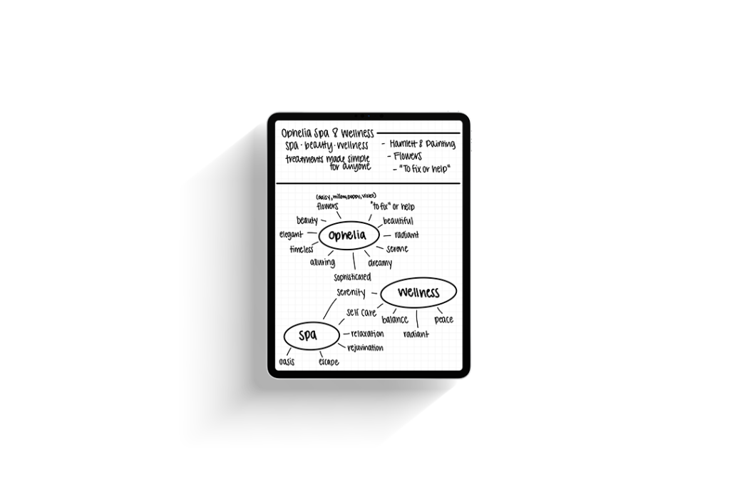
I started by putting ‘pencil to paper,’ or in my case, pencil to iPad. Beginning with a mind map and drawing inspiration for the name, I dissected what Ophelia represented, their brand objectives, and more. Following this process, I began sketching out wordmark logo concepts for Ophelia’s logo suite.
To ensure readability and usability across all platforms, I crafted a comprehensive logo suite for Ophelia. This suite comprises a primary logo, an alternate logo, and two additional marks. Paired alongside the logo suite is the serene, earthy brand colors. Green because its known for healing, brown for grounding, yellow for radiance, and blue for calm. This brand identity maintains brand cohesion while offering versatility. These elements can be effectively utilized across a range of mediums, from small screens to large banners.

To streamline Ophelia’s extensive offerings, I designed a menu booklet for easy readability across all ages and abilities. This booklet features clear descriptions of all services, accompanied by inviting photography, brand icons, and the soothing earthy colors of the brand, creating an inviting experience tailored to their target audience.
For functional purposes, Ophelia required a combined spa intake and consent form. It was essential to maintain the inviting nature of their brand throughout the entire process. Thus, I developed an intake form that reflected Ophelia’s brand identity. Additionally, I designed a personalized wall graphic for clients, complete with a customizable greeting and space for writing client names. This graphic also includes reminders for pre- and post-treatment procedures, facilitating a seamless spa experience and ensuring clients achieve maximum relaxation.
© 2024 Janna Edgar, Janna Creative Studio. All Rights Reserved.